After years of close and dynamic collaboration with Apivita, we were entrusted with the rebranding of their identity and full product range — a pivotal step in positioning the brand firmly within the global natural products market.
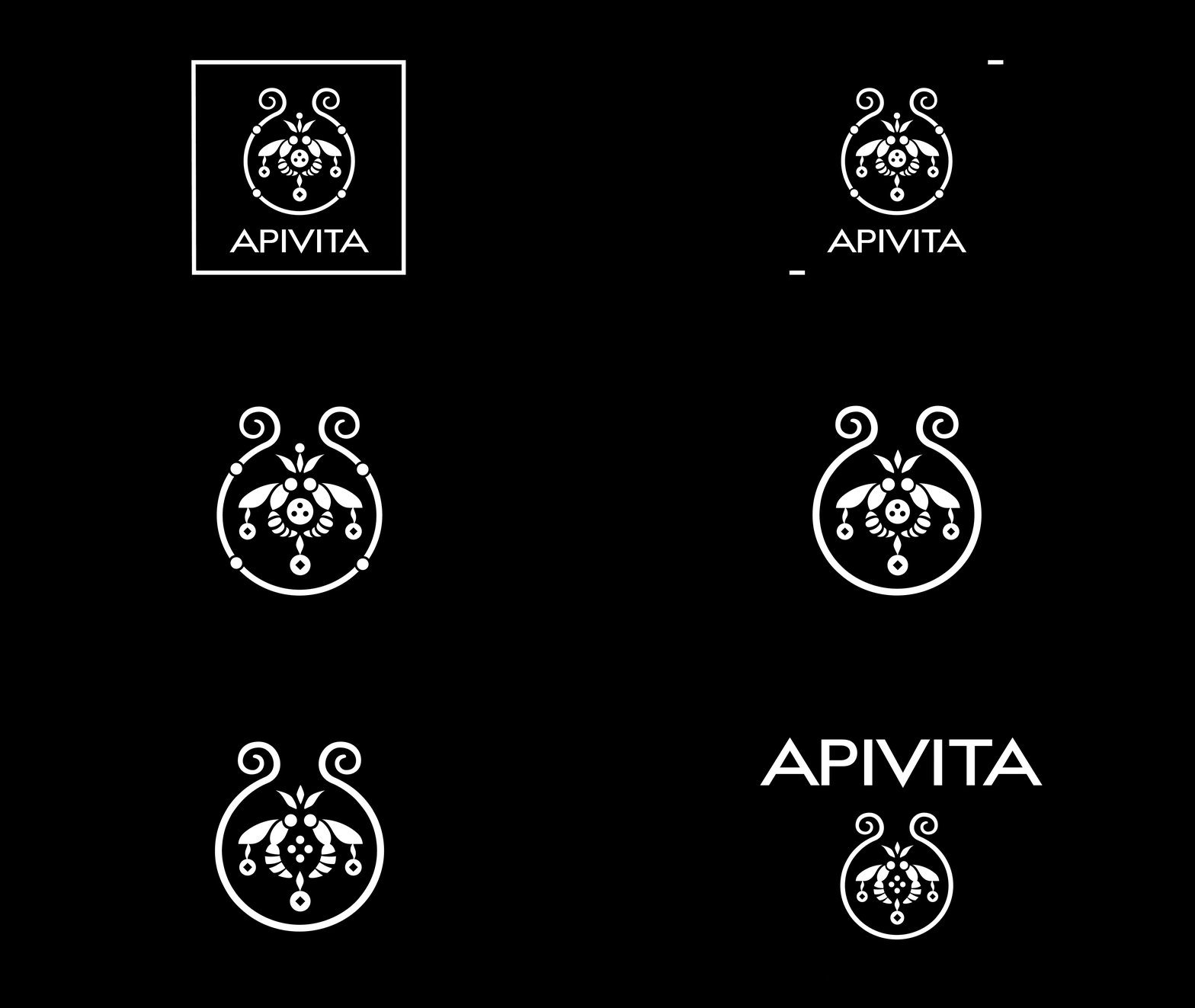
The iconic bee symbol was carefully refined, the Apivita name given greater prominence, and the square frame removed to allow for a more open and contemporary feel. The result is a refreshed, elevated identity that honours the brand’s roots while embracing a bold new future.
Share it


